Themes
Gemini CLI supports a variety of themes to customize its color scheme and
appearance. You can change the theme to suit your preferences via the /theme
command or "theme": configuration setting.
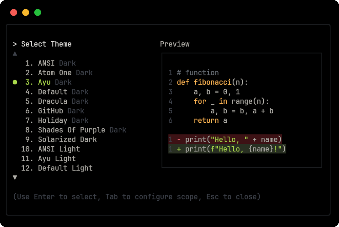
Available themes
Section titled “Available themes”Gemini CLI comes with a selection of pre-defined themes, which you can list
using the /theme command within Gemini CLI:
- Dark themes:
ANSIAtom OneAyuDefaultDraculaGitHubHolidayShades Of PurpleSolarized DarkTokyo Night
- Light themes:
ANSI LightAyu LightDefault LightGitHub LightGoogle CodeSolarized LightXcode
Changing themes
Section titled “Changing themes”- Enter
/themeinto Gemini CLI. - A dialog or selection prompt appears, listing the available themes.
- Using the arrow keys, select a theme. Some interfaces might offer a live preview or highlight as you select.
- Confirm your selection to apply the theme.
Theme persistence
Section titled “Theme persistence”Selected themes are saved in Gemini CLI’s configuration so your preference is remembered across sessions.
Custom color themes
Section titled “Custom color themes”Gemini CLI lets you create your own custom color themes by specifying them in
your settings.json file. This gives you full control over the color palette
used in the CLI.
How to define a custom theme
Section titled “How to define a custom theme”Add a customThemes block to your user, project, or system settings.json
file. Each custom theme is defined as an object with a unique name and a set of
nested configuration objects. For example:
{ "ui": { "customThemes": { "MyCustomTheme": { "name": "MyCustomTheme", "type": "custom", "background": { "primary": "#181818" }, "text": { "primary": "#f0f0f0", "secondary": "#a0a0a0" } } } }}Configuration objects:
text: Defines text colors.primary: The default text color.secondary: Used for less prominent text.link: Color for URLs and links.accent: Used for highlights and emphasis.response: Precedence overprimaryfor rendering model responses.
background: Defines background colors.primary: The main background color of the UI.diff.added: Background for added lines in diffs.diff.removed: Background for removed lines in diffs.
border: Defines border colors.default: The standard border color.focused: Border color when an element is focused.
status: Colors for status indicators.success: Used for successful operations.warning: Used for warnings.error: Used for errors.
ui: Other UI elements.comment: Color for code comments.symbol: Color for code symbols and operators.gradient: An array of colors used for gradient effects.
Required properties:
name(must match the key in thecustomThemesobject and be a string)type(must be the string"custom")
While all sub-properties are technically optional, we recommend providing at
least background.primary, text.primary, text.secondary, and the various
accent colors via text.link, text.accent, and status to ensure a cohesive
UI.
You can use either hex codes (e.g., #FF0000) or standard CSS color names
(e.g., coral, teal, blue) for any color value. See
CSS color names
for a full list of supported names.
You can define multiple custom themes by adding more entries to the
customThemes object.
Loading themes from a file
Section titled “Loading themes from a file”In addition to defining custom themes in settings.json, you can also load a
theme directly from a JSON file by specifying the file path in your
settings.json. This is useful for sharing themes or keeping them separate from
your main configuration.
To load a theme from a file, set the theme property in your settings.json to
the path of your theme file:
{ "ui": { "theme": "/path/to/your/theme.json" }}The theme file must be a valid JSON file that follows the same structure as a
custom theme defined in settings.json.
Example my-theme.json:
{ "name": "Gruvbox Dark", "type": "custom", "background": { "primary": "#282828", "diff": { "added": "#2b3312", "removed": "#341212" } }, "text": { "primary": "#ebdbb2", "secondary": "#a89984", "link": "#83a598", "accent": "#d3869b" }, "border": { "default": "#3c3836", "focused": "#458588" }, "status": { "success": "#b8bb26", "warning": "#fabd2f", "error": "#fb4934" }, "ui": { "comment": "#928374", "symbol": "#8ec07c", "gradient": ["#cc241d", "#d65d0e", "#d79921"] }}Example custom theme
Section titled “Example custom theme”
Using your custom theme
Section titled “Using your custom theme”- Select your custom theme using the
/themecommand in Gemini CLI. Your custom theme will appear in the theme selection dialog. - Or, set it as the default by adding
"theme": "MyCustomTheme"to theuiobject in yoursettings.json. - Custom themes can be set at the user, project, or system level, and follow the same configuration precedence as other settings.
Themes from extensions
Section titled “Themes from extensions”Extensions can also provide custom themes.
Once an extension is installed and enabled, its themes are automatically added
to the selection list in the /theme command.
Themes from extensions appear with the extension name in parentheses to help you
identify their source, for example: shades-of-green (green-extension).
Dark themes
Section titled “Dark themes”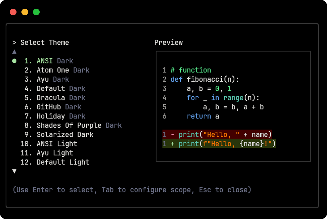
Atom One
Section titled “Atom One”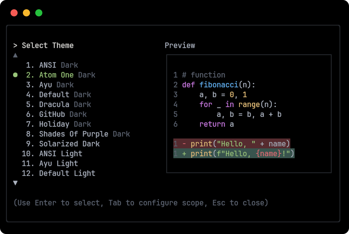
Default
Section titled “Default”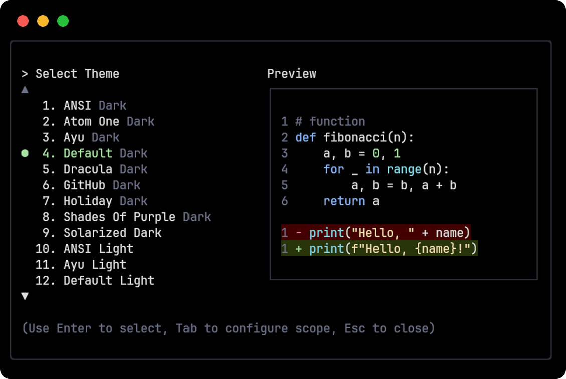
Dracula
Section titled “Dracula”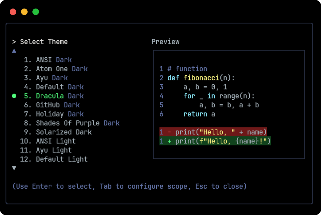
GitHub
Section titled “GitHub”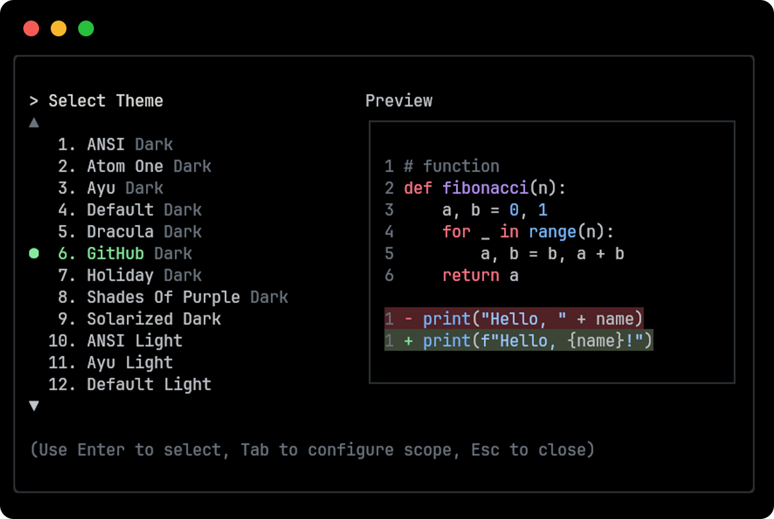
Holiday
Section titled “Holiday”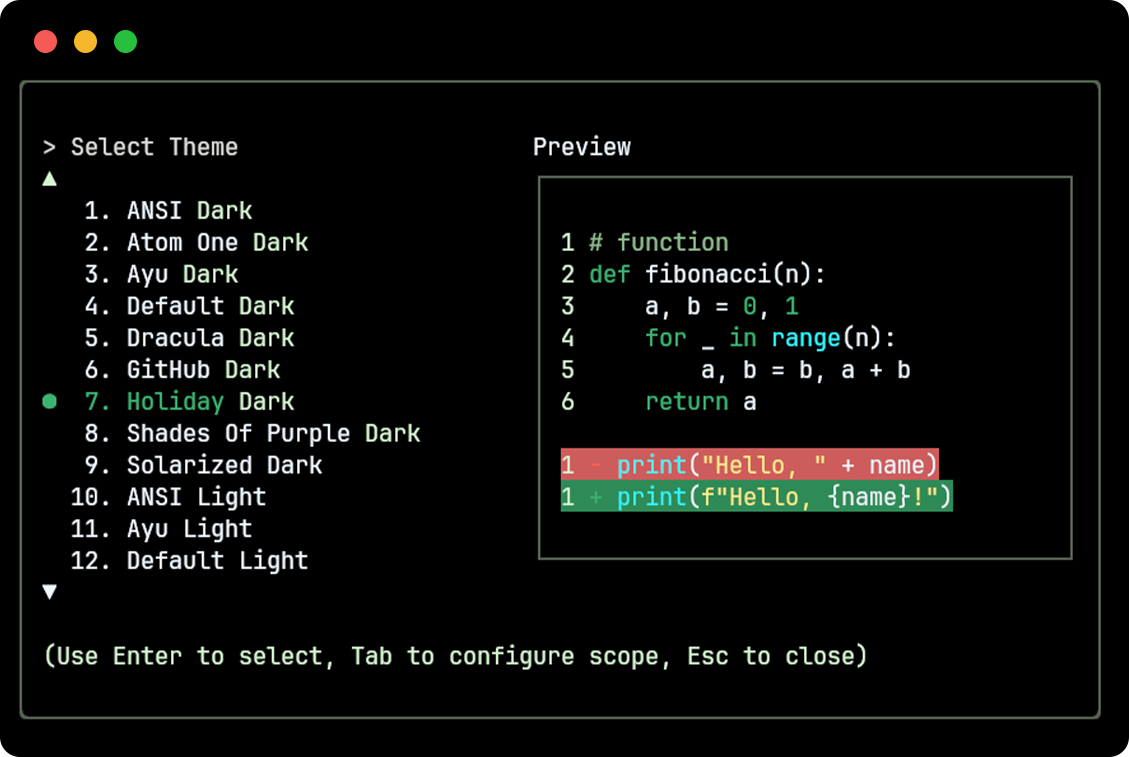
Shades Of Purple
Section titled “Shades Of Purple”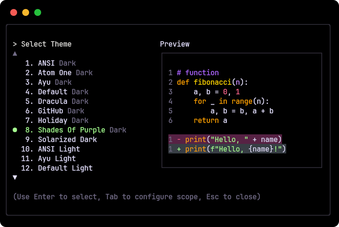
Solarized Dark
Section titled “Solarized Dark”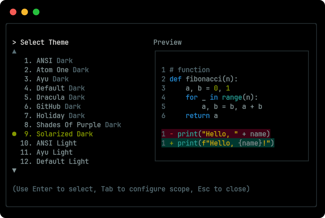
Tokyo Night
Section titled “Tokyo Night”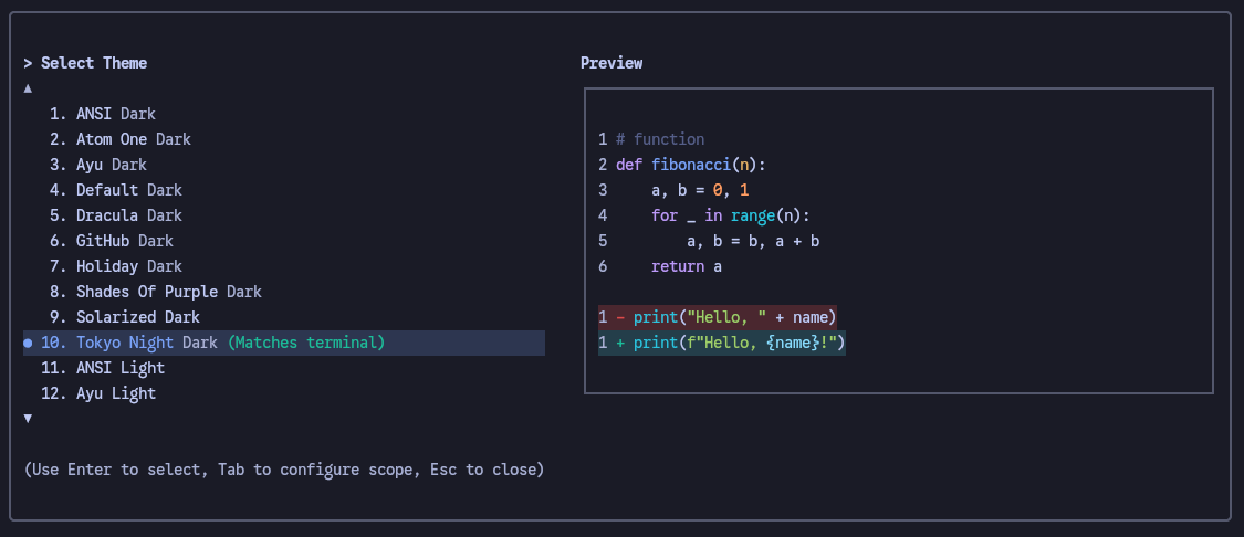
Light themes
Section titled “Light themes”ANSI Light
Section titled “ANSI Light”
Ayu Light
Section titled “Ayu Light”
Default Light
Section titled “Default Light”
GitHub Light
Section titled “GitHub Light”
Google Code
Section titled “Google Code”
Solarized Light
Section titled “Solarized Light”